Illustration style
A gouache children's book
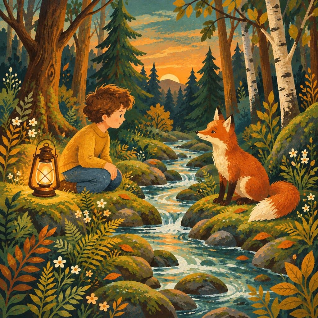
Gouache is watercolour with white pigment added: the colour covers the paper instead of letting it show through. That gives the bold flat colours we associate with picture books of the fifties and sixties.
Read the whole story for freeThe same style throughout the bookeBook £4.50
The colour of the post-war years
Technically, gouache is quickly explained: a water-based paint with chalk or white pigment added. It covers the paper, dries matt and can be layered. For post-war printing it was ideal, because clearly defined areas reproduced cleanly.
Mary Blair shaped the imagery of that era like almost no one else. She worked for Disney and created the visual world of Alice in Wonderland and Peter Pan, then the ride It's a Small World for the 1964 World's Fair. Her colour combinations were so unusual that Walt Disney had to push them through against strong resistance within the studio.
Alice and Martin Provensen painted the same pictures together, often without anyone being able to tell who had done what. In 1984 they received the Caldecott Medal for The Glorious Flight.
In Europe, Miroslav Šašek embodies this visual language. His This Is series began in 1959 with This Is Paris and showed children cities in crisp, flat gouache. From the Czech tradition also comes Jiří Trnka, winner of the Hans Christian Andersen Medal in 1968.
The names behind it
Mary Blair
Colour studies for Alice in Wonderland and Peter Pan, Walt Disney Productions, 1951
Her flat colours, combined in unusual ways, defined the look of a whole era. Walt Disney pushed them through despite resistance in the studio.
Alice and Martin Provensen
The Glorious Flight, Caldecott Medal, 1984
They painted the same pictures together. Their gouache pairs crisp areas with a storyteller's warmth.
Miroslav Šašek
This Is Paris, W. H. Allen, 1959
The start of a series that introduced cities to children. Šašek showed that a non-fiction picture book can be beautiful to look at.
Jiří Trnka
Hans Christian Andersen Medal for illustration, 1968
He stands for the Czech picture-book tradition, read in both the East and the West of Europe.
How do you recognise gouache?
- Opaque, matt areas of colour, without shine.
- A light colour visibly laid over a dark one, which the gouache covers.
- Clearly defined shapes, often without an outline.
- A limited palette, kept up from one end of the book to the other.
- Visible brush texture in the flat areas, because the paint is laid on thickly.
Which stories gouache suits
Gouache excels at places and journeys: cities, houses, vehicles, landscapes, everything with architecture. It's no accident that Šašek's city books were made in this technique.
It also works for stories set in a particular era, because it brings the fifties and sixties to mind by itself. For a book meant for grandparents, it can recall the pictures of their own childhood.
For fine expressions it sits in the middle: better than collage, less good than ink and watercolour. In terms of age, it suits children from about three.
Good to know
What's the difference between gouache and watercolour?
Gouache contains white pigment and so covers the paper; watercolour is transparent and lets it show through. In practice, gouache gives full, flat colours and watercolour light, transparent ones.
Doesn't this style look a bit old-fashioned?
It recalls the fifties and sixties, and that's exactly its charm. For a more contemporary look, ligne claire or watercolour suit better.
From what age does the gouache style suit?
From about three. The crisp flat areas are easy to read, and the love of detail in the houses and streets rewards anyone who looks closely.
Does the style stay the same throughout the book?
Yes. All 14 double pages are illustrated in the style you choose, and so are the cover and the character's portrait.
- 1.Walt Disney Family Museum: Mary Blair, Mid-Century Magic.What it confirms: Mary Blair's colour studies for Alice in Wonderland and Peter Pan, and It's a Small World for the 1964 World's Fair.
- 2.American Library Association: Caldecott Medal & Honor Books, 1938 to present.What it confirms: Alice and Martin Provensen received the Caldecott Medal in 1984 for The Glorious Flight.
- 3.Miroslav Šašek, overview of his work.What it confirms: This Is Paris was published in 1959, the first volume of the series.
- 4.IBBY: Hans Christian Andersen Awards, winners.What it confirms: Jiří Trnka received the medal for illustration in 1968.
The other styles
- 3D animation
- Andean textile art
- Art Nouveau
- Chinese ink
- Coloured pencil
- Cordel woodcut
- Fine pen
- Graphic and simple
- Graphic novel
- Ink and watercolour
- Ligne claire
- Minhwa world
- Nordic fairy tale
- Paper collage
- Risograph
- Silhouettes
- Tingatinga world
- Ukiyo-e inspired
- Watercolour
- Wax crayon
At a glance: all illustration styles, how it works, frequently asked questions, the book without a photo, reading the story before you buy and the AI children's book.